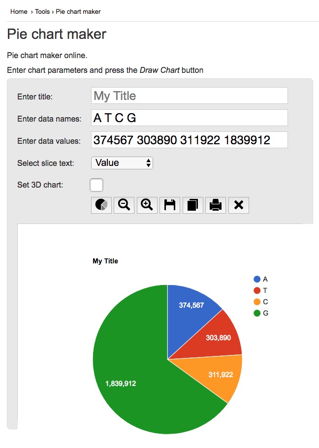
一个简便易用的工具 online version:
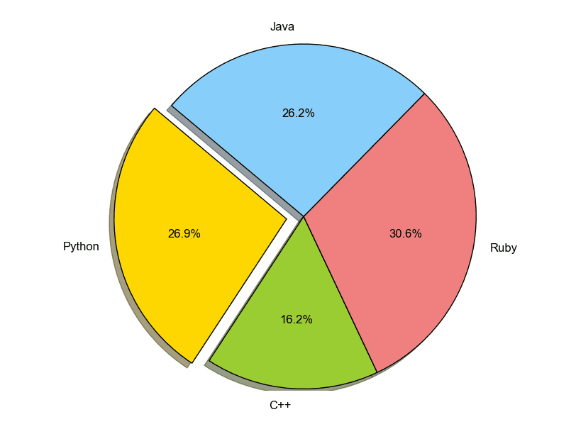
Python: pie plot example
import matplotlib.pyplot as plt

# Data to plot
labels = 'Python', 'C++', 'Ruby', 'Java'
sizes = [215, 130, 245, 210]
colors = ['gold', 'yellowgreen', 'lightcoral', 'lightskyblue']
explode = (0.1, 0, 0, 0)  # explode 1st slice

# Plot
plt.pie(sizes, explode=explode, labels=labels, colors=colors,
        autopct='%1.1f%%', shadow=True, startangle=140)

plt.axis('equal')
plt.show()
The output looks like:
# show absolute value
# https://stackoverflow.com/questions/14171021/matplotlib-pie-chart-how-to-replace-auto-labelled-relative-values-by-absolute-v
total = sum(sizes)
ax.pie(sizes, labels=labels,
       autopct=lambda(p): '{:.0f}'.format(p * total / 100), shadow=False, startangle=140)
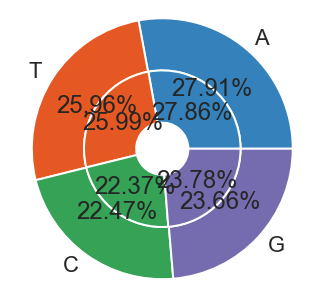
Nested pie plots
# https://matplotlib.org/3.1.0/gallery/pie_and_polar_charts/nested_pie.html#sphx-glr-gallery-pie-and-polar-charts-nested-pie-py

fig, ax = plt.subplots(figsize=(6,6))

size = 0.4 # 可通过此参数,调节中间空心部分大小

val1 = [9251937, 8605104, 7445960, 7840986]
val2 = [4310065, 4020865, 3461761, 3679722]

cmap = plt.get_cmap("tab20c")
outer_colors = cmap(np.arange(4)*4)
# inner_colors = cmap(np.array([1, 2, 5, 6, 9, 10]))

# edgecolor='w' 可以设置不同的patch之间有白线,看起来更美观一些?
ax.pie(val1, radius=1, colors=outer_colors,
       wedgeprops=dict(width=size, edgecolor='w'), labels=['A', 'T', 'C', 'G'],autopct='%1.2f%%')

ax.pie(val2, radius=1-size,colors=outer_colors,
       wedgeprops=dict(width=size, edgecolor='w'),autopct='%1.2f%%')

ax.set(aspect="equal")
plt.savefig(savefn)
plt.show()
If you link this blog, please refer to this page, thanks!
Post link:https://tsinghua-gongjing.github.io/posts/pieplot.html
Previous:
BEDTOOLS
Latest articles
Links
- ZhangLab , RISE database , THU life , THU info
- Data analysis: pandas , numpy , scipy
- ML/DL: sklearn , sklearn(中文) , pytorch
- Visualization: seaborn , matplotlib , gallery
- Github: me